Friday, 12 April 2013

Final Design Project

Title: Hall of Guilt
Theme: Social Media Issues
Artist: Hong Shi Min
Student ID: B1101991

In this modern era, social media apparently has become an essential element in our daily life. Social media allow us to create, share and exchange information or ideas in a very creative and efficient way. Yet, social media doesn’t merely bring benefits. Nowadays, social media issues have come out in an increasing rate. Social media issues include security, privacy, scam, cyber-bullying, cyber-harassment and so on. Cyber-bullying is when a child, preteen or teen is harassed, threatened, tormented, embarrassed, humiliated or otherwise targeted by another child, preteen or teen using the Internet, interactive and digital technologies or mobile phones. Cyber bullying has different forms. It may involve sending threatening, mean and vulgar messages or images, posting private and sensitive information about others, spreading rumors and deliberately excluding someone from an online social group. Cyber bullying can be as simple as sending an email, yet, the effects brought to the victims can be very serious. For instance, damaged reputation, depression and even suicide attempt.
My idea is to not only show that cyber-bullying is peccant and morbid, but also to create awareness of cyber-bullying. I have come out with few popular social media to involve in my painting which includes social networks, video and photo sharing websites and website search engine. They are YouTube, Google, Weibo, Stumble, Flickr and Badoo. Instead of using the logo or words, I only used colors of the icons to represent these social media. The context of my artwork is showing portraits being exhibited in a hall, named “Hall of Guilt”, and the artists of these portraits are the descriptions of cyber-bully. As you can see in my artwork, the artist of each portrait to show that cyber-bully is an offender, anonymizer, stalker, liar and threatener. The concept of my painting is using Cubism to show the interaction between cyber-bully and social media. Other than that, geometry has been used in my artwork to bring the effects of hands randomly and subtly showing on the wall. 
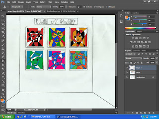
     Here's my sketch!

Here's my under drawing.
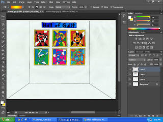
I created a new layer and painted the portraits.
the "Hall of Guilt" signboard was colored and I used Gradient and Subtract effect. The frames were colored using brush and different tones as well.
I used Bevel & Emboss and Inner Glow effects to make the portraits having glass effect.
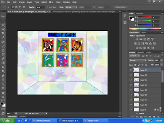
I created few layers to put different colors of geometry on the background and lower the opacity to make the spatial effect.
I cropped the part I wanted from Google's image and dropped a shadow. I created a layer for the shadow so that I could copy the shadow and paste it to my artwork.
 Here you can see the copied shadow was pasted on the background and lowered the opacity.
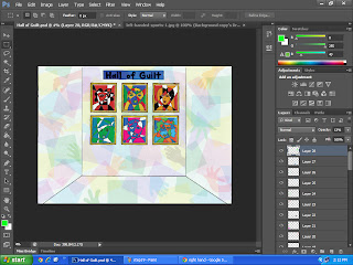
  I have repeated the making and copying shadow steps therefore you can see there are a lot of hands on the wall.
Lastly, I put text for the portraits.
Here's my artwork.
"Hall of Guilt"
Artist Statement:
My artwork explores the relationship between social media and internet users and takes a critical view of cyber-bullying. Cubism makes subtle combination of the portraits and the colors of social media icons. The use of transparency of color and the geometry applied on the wall give viewers a different spatial impression. While seeing this artwork, I hope the viewers can imagine yourselves standing in this Hall of Guilt, looking at the portraits, and have introspection if you have ever done cyber-bullying. The hands from the wall are trying to make connection with you, be aware of cyber-bullying!

Tuesday, 26 March 2013

Central Market Trip


This is my first time visiting Central Market Kuala Lumpur at Pasar Seni. I have to admit that I didn’t put much expectation on this trip since I heard from my friend that this a boring place which sells souvenirs to tourists. Well, I’ve changed my mind after I’ve gone deeper in this market.
Before sharing my experiences, I would like to give a brief introduction of Central Market Kuala Lumpur. Central Market Kuala Lumpur is located at Jalan Hang Kasturi, right opposite Pasar Seni LRT station and just a walking distance away from Petaling Street. What surprised me is this market is like 120 years old!  It was founded in 1888 and originally used as a wet market, while the current building was completed in 1937. It has since been classified as a Heritage Site by the Malaysian Heritage Society and now it is a landmark for Malaysian culture and heritage.
When I was walking in the market, I saw shops selling handicrafts and traditional clothes from multi-ethnicity. There is food court selling Malaysian local food as well. What surprised me is this is not a market selling souvenirs only but a place showing really traditional and local multi-cultural art crafts which even I am not familiar with as a Malaysian. Here are the pictures I took.


There is a busker who has got my attention. What of this street artist attracted me is his architectural drawing while the other buskers here are mainly doing portrait. So I took a step to have a conversation with him. He told me that he has been doing architectural drawing for around 30 years. He said that is his interest which he will never give up. Every day he will come out with at least one work piece. His passion on architectural drawing gains my admiration.
It was quite a good experience visiting Central Market Kuala Lumpur. I have seen not only a lot of art crafts of Malaysia here but also dreams and ambitions.

Sunday, 3 March 2013

Art Movement


Art movement is described as a style, a tendency or a way of doing art which spans over a period of time, practiced by a group of artists. Art movement shares the same artistic style, ideals, timeframe and technical approach.  There are various art movements in the world that are distinctly or subtly different from each other. The artists associated with particular movement may cohere to specific guiding principles. Some art movements show similarities as they were influenced by another art movement whereas some have little in common with other movements. There is no fixed theory or rule determining what forms an art movement.
It is interesting to study the differences between art movements. The art movement which attracts me the most is Op Art.
Op Art, short for ‘Optical Art’, is a method of painting which concerns creating optical illusions based on effects of colors, shapes, lines or patterns. Op Artists play with the perception of the viewers by subverting the relationships between picture plane and dynamic colors, shifting tones and ambiguous shapes. It was popular in United States and Europe in 1960s and 1970s. It was greeted with a certain degree of skepticism by the critics. Op Art is also a form of Abstract Art and it is closely connected to the Kinetic and Constructivist Art movements.
I like Op Art because it gives me a feeling of magic. When we look at Op Art works, the images are definitely static and flat, but they generate an illusion of movement with conscious tricks that create unstable picture surfaces. They give us an impression of flashing, vibrating, swelling, warping or waving on the Op Art images. I still remember when I first saw an Op Art work, I was amazed and like “hey, the picture is moving!!” 

 
Source
           "Rings rotating"

"There are waves!"

"Wondering why you keep seeing black dots?"

One more art movement I like is Land Art, which we also call Earth Art. Land Art is an art movement with landscapes and art works are inextricably linked. I like Land Art because it is created in the nature. Land Art artists use natural materials such as rock, soil, water, leaves and so on to create art works.